NOMNOM
Overview
NOMNOM is a food scan app for foodie travelers who want to experience street food abroad. Because of the language barrier with street food vendors, it’s challenging to get information about ingredients. NOMNOM helps travelers who have food allergies safely choose items by scanning food and see the ingredients in real time. The app enables foodies to find street food places based on themes, time, distance, type of food, and mood. It also helps with money transactions since street food vendors usually only accept cash.
Role
Product design, Branding
Time
November 2019
Context
Solo project for Visual Strategy class
Methods & Tools
Contextual Inquiry, Interview, Secondary Research, Competitive Analysis, Sketch
Design process
Following the HCD process, I began this project by conducting user interviews and looking into secondary research. After synthesizing findings, I defined the problem and brainstormed ideas. From the sketches to the fidelity prototypes, I created the first version of the application. I conducted usability testings to validate the idea and iterated the design based on the feedback.
Understanding target audience
Foodie Travelers
Indulgent foodie travelers are global explorers on the lookout for genuine food experiences. This group of travelers will indulge their love of food, dessert, and drink. They typically have the money, status and knowledge to pursue their passions. A large part of this audience is represented by SINKS and DINKS.
Problems determined
To understand travelers’ street food experiences when traveling abroad, I performed semi-structured interviews with 6 people who have traveled abroad before.
From my research, I realized foodie travelers’ pain points:
#1 The lack of information about location, open hours and reviews of street food places.
#2 Hard communication with vendors due to a language barrier.
#3 It makes them hesitate to purchase food due to the possibility of food allergy.
#4 Most street food vendors only accept cash but nowadays people usually don’t carry cash. Also, the different currency is difficult.
SWOT analysis
I consider food order apps and restaurant apps are NOMNOM’s competitors in that NOMNOM will offer food/restaurant information and reservation service.
Strength: Food scan helps people
#1 Avoid food allergies
#2 Overcome language barriers
Weakness: The lack of information about street food compared to general restaurants
Opportunity: Street food market is huge but not enough international business is involved yet
Threat: There are big competitive markets for food ordering or booking a restaurant
Design requirements
From the insights, I identified the problem statement above. Hence, the solutions that need to be accounted for:
#1 Help travelers get information about food ingredients.
#2 Help travelers find local street food places based on their preferences.
#3 Enable travelers to conveniently pay for street food that takes cash only.
#4 Allow travelers to learn about food and cultural context.
Design goals
#1 Be simple. Customers should be able to use the app seamlessly outside. They also might carry luggage and other travel items so it should be intuitive and simple to navigate.
#2 Be delightful. Experiencing food on a trip is delightful. The app should let customers stay in fun and exciting mood.
#3 Be smart. I should not make customers do extra tasks to use this app. I should consider the most effective interaction points that customers seamlessly experience food.
A New Generation Food App
Delightful design
I designed the playful food monsters NOMNOM to deliver fun and delightful feelings. It also shows the diversity of food from all over the world because NOMNOM is an international food app that gives you exotic food experiences.
See only relevant results
I designed the food allergy icons and enabled customers to filter ingredients they need to avoid before exploring food places so customers see the results not including the ingredients.
Discover a memorable food experience
The customers have the suggestions based on the current location so they can wing it. The sorts help customers to narrow down search results.
Overcome language barriers
Most street food vendors are not fluent in English so it’s hard to get information about unfamiliar foods. NOMNOM will search the food and provide information immediately. Customers can also avoid food allergy reactions.
Don’t hesitate to purchase due to cash only
Customers can pay by transferring money. NOMNOM provides currency information so customers can quickly calculate the price.
How I got there
Based on the research findings, I understood that travelers have different needs when experiencing local street food. Therefore, I designed various personas to prioritize the type of users to the application. I have divided the personas into two categories: the primary personas and the secondary personas.
POV Frame work to empathize
Based on the insights I gathered through the user and market research, I used the POV frame for the primary personas to have a broader conversation around a series of topics and data that helped me shape this brand from the eyes of customers.
POV 1: Kelly is a 21-year-old college student who loves to try local street food when traveling. She needs a way to find street food places around her location or on her trip route that don’t clutter her itinerary, while letting her try authentic quality street food as an interesting cultural experience. Also, she needs a way to pay by cash because the different currency is challenging and it’s hard to find an ATM to withdraw cash abroad.
POV 2: Joe is a 27-year-old working professional who has nuts allergy. He needs a way to know about food ingredients to avoid allergic reactions because it’s hard to go to a hospital or get medications while traveling.
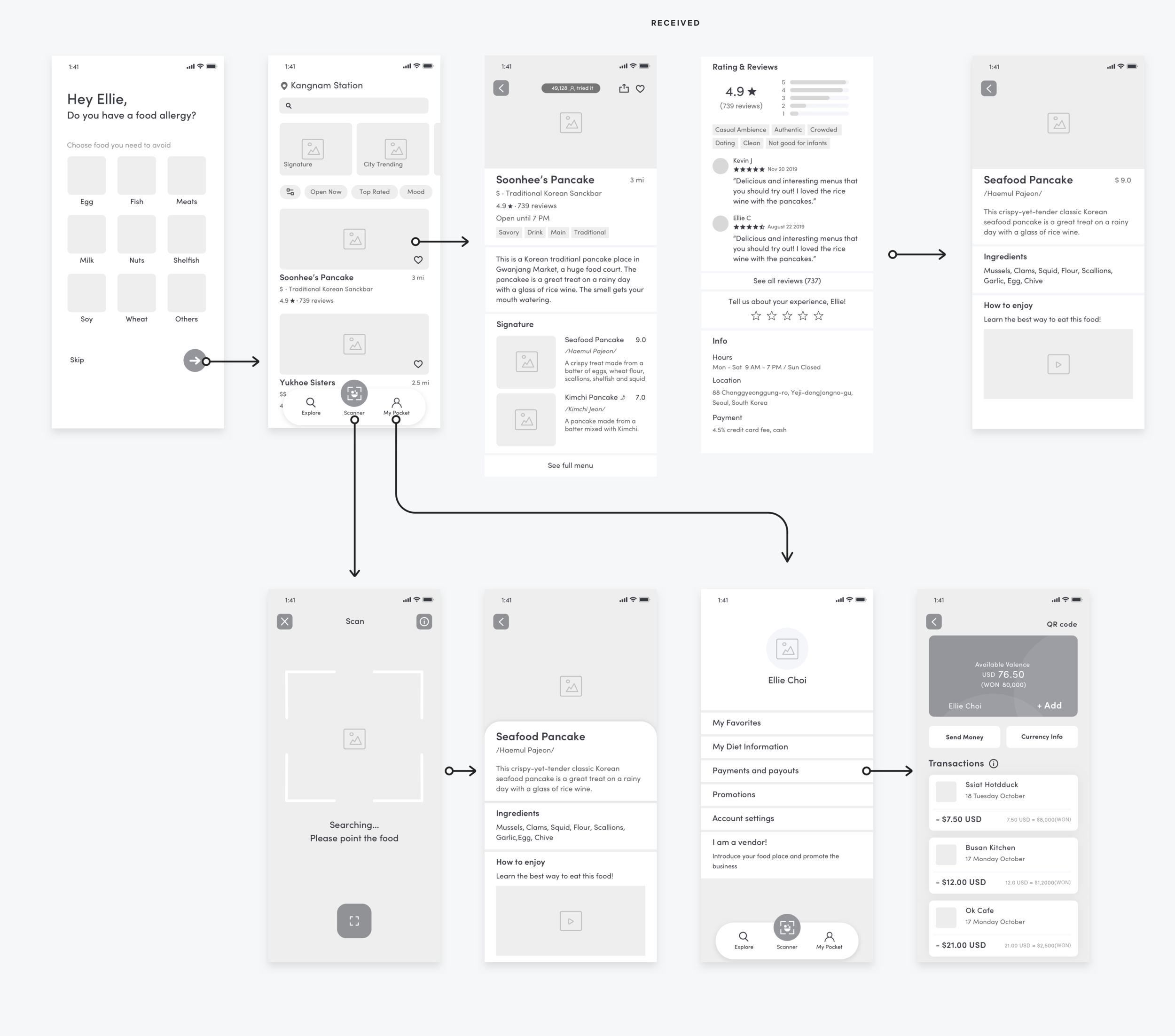
Based on the design requirements, I defined 3 main features: food places-exploring, food scanning, and cash payment. Once users enter the app, they can add personal diet settings if they have food allergies so they will only see relevant list. The landing page will introduce the platform and educate new users to learn how it works.
Information architecture
User testing
I conducted usability testing with 6 people who love food and travel in the age group of 20 - 40s. From the test, I learned:
Too many filters and theme options can be confusing since they are not familiar to new food. Customers want to have limited suggestions.
Most people responded they might not use “I am going today.”
Customers want reward system.
‘Add Money’ button is hard to discover
Wireframe
Based on user feedback, I outlined the wireframes of the app and created several key paths of the scenarios to analyze the flow of interaction of the app.
Interactions
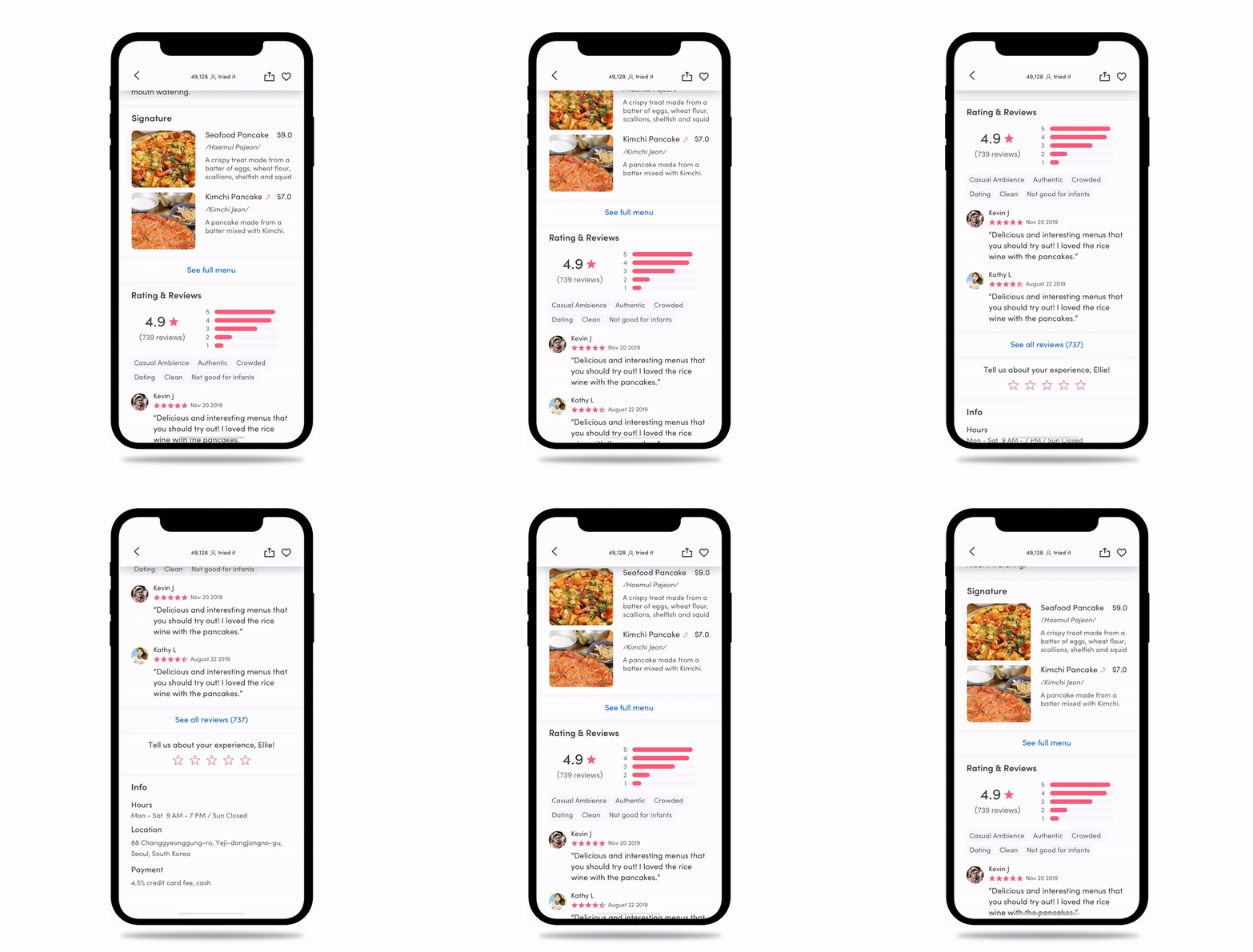
I played with prototyping tools to explore micro-interactions and tested the interactions with the clickable prototypes on a mobile device.
In real life
Reflection
This app is scalable
As I conducted interviews and research, I found 32 million American has food allergy. Especially, one in 13 children has severe allergy reactions to certain food. Even though they are educated to avoid the certain food, they can’t quickly recognize it alone. I consider this app can help them deal with their food allergy situations in school dining halls or snacking with friends. Also, they can find a food place that they can enjoy food without concerns. I will do more research about better usability for kids so I can improve the entire app experiences.


