My Fav Seat
Overview
My Fav Seat is a centralized Mac Lab management system that helps busy design school students lab check in, manage breaks and rent design equipment efficiently. The application allows students customize their seats and avoid a long line as well as librarians keep track of rented devices with less steps. It simplifies the whole lab experience from checking in to checking out.
Role
UX/UI Design, Interaction Design, Research
Time
October 2019 (1 week challenge)
Methods
Survey, Interview, Storyboarding, Sketching, Persona, Agile, Wireframing, Prototyping, User testing
Tool
Sketch, Illustrator, Principle
Meet My Fav Seat
Seat reservation & device rental
Students reserve their favorite seat while traveling to school to avoid waiting in a line. Also, get a rental device ready-to-go so they can check in faster and more efficiently.
Change a seat
Students reserve their favorite seat while traveling to school to avoid waiting in a line. Also, get a rental device ready-to-go so they can check in faster and more efficiently.
Break time management
Students can manage their break time limited to 30 minutes so they don’t need to worry about losing their seat during a meal time.
How I got there
Interview & Survey
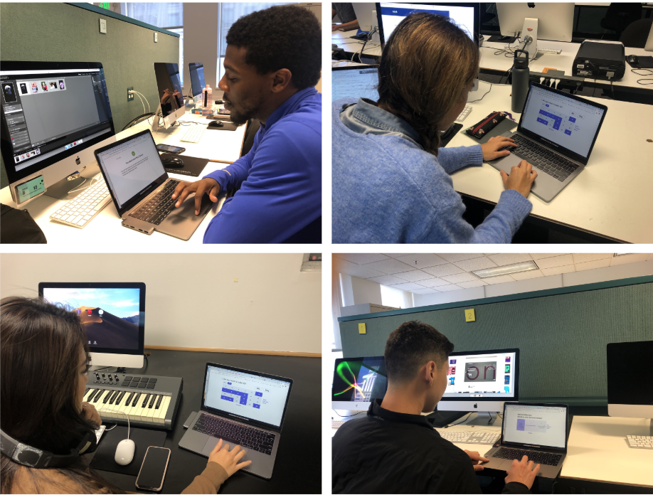
I began the project by conducting semi-structured interviews with 4 students who were using the Mac Lab and 4 librarians working for Academy of Art University to understand their check-in habits, seat choices, device rentals, struggles, and so on. Through 3 observation sessions, I found some habitual patterns at check-in desk and in the lab. The photos below show the process of a check-in.
Synthesis
With the interview & survey results from 56 respondents, I created 2 personas that embodied the archetypes of my user group. I then mapped out the user journey of our persona Jenny, including her thoughts and feelings during her typical school day. From this, I was able to temporally visualize Jenny’s areas of frustrations and create a focal point in the problem space.
Insights
I found present ID & seat selection are the most frustrating phases. Also, many students commute by BART or bus, which means there’s an opportunity I can utilize the time during a commute to check in abroad. So I decided to design mobile app due to its portability and convenience. Also, to design a whole experience, I also consider kiosk and admin web app.
Problem statement
Design requirements
The solution needs to:
Help students learn seat availability and reduce time for seat selection
Help students manage their break time for lunch
Help students who forgot to bring their ID card can check in the lab with less steps
Help librarian manage the seats and rentals in one system
Ideation
With the design requirements in mind, I began to ideate on potential solutions through sketches and storyboards.
Seamless user experience
Users need to see different services at different phases to seamlessly experience the lab. I came up with a solution with three different interfaces including a Kiosk for self check-in, a mobile app for students and an admin web app for librarians. For this project, I designed a mobile application and kiosk interactions.
Paper prototype
I then created paper prototypes based on the IA to quickly test the general usability and improve confusing elements. This is conducted by asking users to execute the several tasks with no help.
Wireframe
Then, using the feedback from the usability test, I outlined the wireframes of the app and created several key paths of the scenarios to analyze the flow of interaction of the mobile app and kiosk.
Hi-fi design & User testing
After several rounds of critique on the wireframes, I then moved on to creating high-fidelity mock ups. I aimed to design intuitive and simple UI since the goal is to reduce time for check-in. Therefore, this app guides users by showing only information that users need so they seamlessly move to the next steps.
I conducted user testing sessions to test usability of the mobile app and kiosk interactions.
Design iterations
I finalized the design based on findings from the user testing sessions. The blue color is used as the main theme to associate the app with a trustful feeling. Also, the yellow color is used as the secondary color to bring out creative and cheerful vibes for design school students.
Final design flows
Seat reservation & device rental
Change a seat
Break time management
A quick check-out
Kiosk design
Next steps
Increase students engagement to create a student community.
If students find their reserved Mac is not working properly after arriving to the lab, this whole system doesn’t help them have better check-in experience. To solve this problem, I will think about a way to encourage students feel they belong to this community and want to help each other by reporting malfunctions.


