Monet from de Young
Overview
The main goal of this project was to design and build a responsive museum website by code. I chose Claude Monet from de Young Museum in San Francisco.
Role
Design for website, iPad and mobile application and build the application by html, CSS, Javascript and jQuery.
Time
Spring 2019
Context
Solo project Methods & Tools
Methods & Tools
Secondary Research, HTML, CSS, Javascript, Java
Ambivalent Emotions
The design concept is ambivalence, simultaneous and contradictory feelings. During my first semester, I was excited to learn about design that I love the most but my perfectionism pushed me in the feelings of dissatisfaction, it was painful. Fortunately, Dr. Dweck’s growth mindset helped me keep striving for growth with a belief in myself and taught me I should be patient and persistent to be a great designer. I realized design is not a magic that makes people wow, it is prototyping, testing, analyzing and refining a process. So it’s ok to struggle and fail in a process. The time I was struggling with the complicated emotions inspired me to design this website.
Purple presents the ambivalent feelings since it combines the calm stability of blue and the fierce energy of red.
Sitemap
I aimed to make this website simple to effectively deliver information about Monet and de Young museum.
Homepage
Water Lilies
Derivative Works
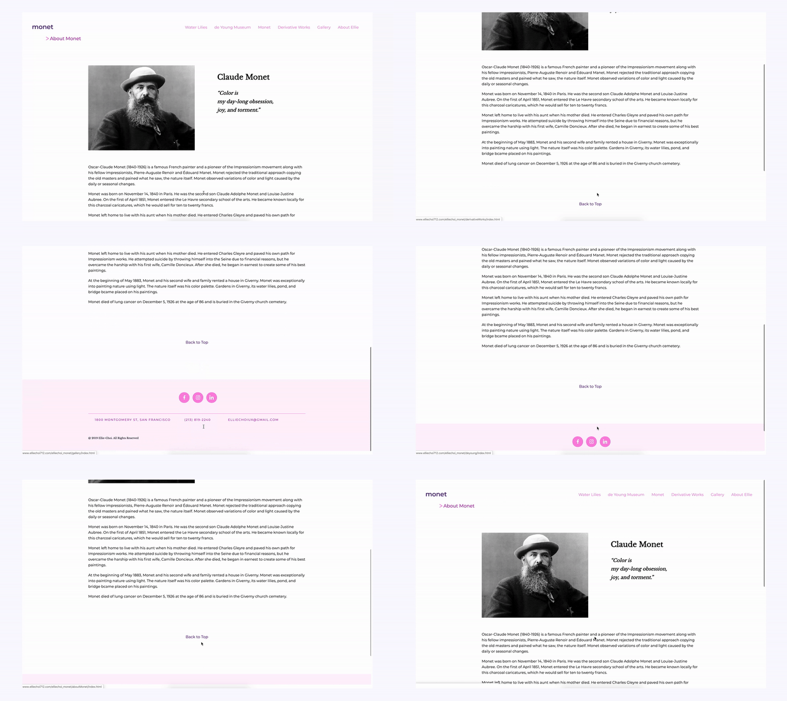
About Monet
Responsive Design
Media queries to create a stylesheet for multiple devices
I used media query codes in CSS to create stylesheet for a mobile version and an iPad version.
The breakpoint for mobile devices: min-width: 320px ~ max-width: 767px
The breakpoint for iPad devices: min-width: 768px ~ max-width: 1023px


